| View previous topic :: View next topic |
| Author |
Message |
Mr C.
Joined: 23 Sep 2004
Posts: 146
Location: Not behind Tesco's any more but still in in Whitstable
|
 Posted: Sun Apr 23, 2006 6:50 pm Post subject: WHATS THIS ALL ABOUT THEN :o) Posted: Sun Apr 23, 2006 6:50 pm Post subject: WHATS THIS ALL ABOUT THEN :o) |
 |
|
_________________
GoldFish Don't Bounce. |
|
| Back to top |
|
 |
frankus

Joined: 13 Sep 2004
Posts: 1100
Location: Chelmsford/Arachnipus
|
| Posted: Sun Apr 23, 2006 8:57 pm Post subject: |
|
|
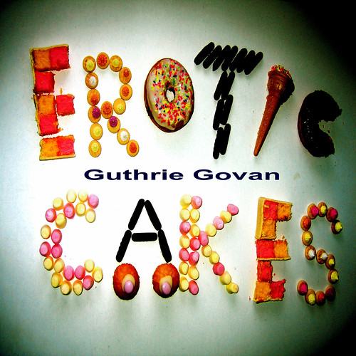
Battenburg, Fairy Cakes and Iced Doughnuts are the sugary fatty food of the gods..
but iced gems and that cornet monstrosity are confectionary evil.  it'd be like eating riveta with nutella spread on it... the horror. it'd be like eating riveta with nutella spread on it... the horror.
One could get diabetes merely looking upon that... 
_________________
Fabulous powers were revealed to me the day I held my magic Suhr(d) aloft and said "by the power of great scale!"
I have the power! |
|
| Back to top |
|
|
Onion
Joined: 11 Jan 2006
Posts: 30
|
| Posted: Sun Apr 23, 2006 11:40 pm Post subject: |
|
|
is that the cover of somthing wonderful?  |
|
| Back to top |
|
|
sumis
Joined: 22 Feb 2005
Posts: 570
Location: gothenburg, sweden
|
| Posted: Sun Apr 23, 2006 11:43 pm Post subject: |
|
|

this is not fair! aargh. give me the album dammit!
. |
|
| Back to top |
|
|
markmcg

Joined: 14 Sep 2004
Posts: 191
Location: Edinburgh
|
|
| Back to top |
|
|
hecanrock
Joined: 22 Dec 2004
Posts: 32
Location: london
|
| Posted: Mon Apr 24, 2006 9:09 am Post subject: |
|
|
If that's the album cover then it pants.
It looks amateur, which is a shame.
How are artists ike guthrie supposed to look professional if their album artwork looks like it was designed by someone in powerpoint.
Once again, let me design it and he will look like a credible artist. Guthrie needs marketing in a professional way, or he will not be taken seriously. |
|
| Back to top |
|
|
jordan
Joined: 28 Sep 2004
Posts: 161
|
| Posted: Mon Apr 24, 2006 12:01 pm Post subject: |
|
|
| hecanrock wrote: | | If that's the album cover then it pants.....Once again, let me design it and he will look like a credible artist. Guthrie needs marketing in a professional way, or he will not be taken seriously. |
Good to see there's no alterior motive behind your criticism there.
And I'm not sure I agree with the second comment - look at Surfing With The Alien - it's a cartoon drawing which I've always thought looked a bit odd, but it still sold the odd copy I believe. |
|
| Back to top |
|
|
art

Joined: 19 Apr 2005
Posts: 69
|
| Posted: Mon Apr 24, 2006 12:43 pm Post subject: |
|
|
I agree that it needs some work.
The colours are a little off (especially the marshmallows), and the font for his name is really plain.
I like the concept, but it could be done better. What about something hand-drawn?
Or a shopfront selling the Erotic Cakes- this just came to me because of what I believe to be the origin of the name (The Simpsons halloween special where Homer goes into the 3rd dimension and ends up in the real world. "mmmm Erotic cakes". |
|
| Back to top |
|
|
Edovinus
Joined: 10 Sep 2004
Posts: 92
|
| Posted: Mon Apr 24, 2006 9:03 pm Post subject: |
|
|
 |
|
| Back to top |
|
|
drummondrs
Joined: 15 Jul 2005
Posts: 36
Location: Castles made of sand
|
| Posted: Mon Apr 24, 2006 9:30 pm Post subject: |
|
|
Finally its almost ready, I will definately buy it as soon as I can. I just hope the choice of songs makes up for that cover art. It has Delboy written all over it.
_________________
Soon to be proud user of Suhr and hopefully Cornford |
|
| Back to top |
|
|
drummondrs
Joined: 15 Jul 2005
Posts: 36
Location: Castles made of sand
|
| Posted: Mon Apr 24, 2006 9:31 pm Post subject: |
|
|
I like the cake writing idea though
_________________
Soon to be proud user of Suhr and hopefully Cornford |
|
| Back to top |
|
|
treeduck

Joined: 13 Apr 2005
Posts: 173
Location: Manchester, England
|
| Posted: Tue Apr 25, 2006 2:08 am Post subject: Re: WHATS THIS ALL ABOUT THEN :o) |
|
|
| Mr C. wrote: | |
So is this the actual Guthrie Album cover? 
Hmmmm how long now then? |
|
| Back to top |
|
|
sumis
Joined: 22 Feb 2005
Posts: 570
Location: gothenburg, sweden
|
| Posted: Tue Apr 25, 2006 2:13 am Post subject: |
|
|
well, the cake writing is cool. nothing wrong with that. but the extended typeface and guthrie's name in the middle ruins what's good with the thing. two very distinct element. one good, one "powerpointy".
not gonna say more about this, though. (but i DO run a small print/publishing house, and we DO put out books and stuff with award winning graphic design ...)
. |
|
| Back to top |
|
|
alexkhan

Joined: 10 Sep 2004
Posts: 2783
Location: Chino, CA
|
| Posted: Tue Apr 25, 2006 9:46 pm Post subject: |
|
|
I don't have a problem with the cover art. It's just what it is. In a way, it's a reflection of who Guthrie is - he doesn't give a shit about image! It'll all be about the music within. My vote for the worst guitar album cover is Steve Vai's 'Ultra Zone'.
_________________
Ed Yoon
Certified Guthrie Fan-atic
BOING Music LLC - Managing Partner
.strandberg* Guitars USA
Ed Yoon Consulting & Management
Guitar Center Inc. |
|
| Back to top |
|
|
Onion
Joined: 11 Jan 2006
Posts: 30
|
| Posted: Tue Apr 25, 2006 11:27 pm Post subject: |
|
|
| i have to agree, i dont really care what it looks like because if its is a great album it will make it become cool. |
|
| Back to top |
|
|
|

